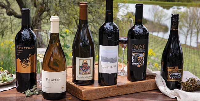
Every wine brand or winery is looking to increase awareness and visibility with the ultimate goal of driving more sales, increasing customers and to keep those customers coming back. Did you know that close to 40% of all wine consumers say they are influenced by the label? It’s true, they in many cases, are looking for unique, eye-catching and creative labels while in other cases they are subconsciously judging wines using that same criterion. Which makes sense if you’ve never tried a wine, what else do you have to go on?
In the increasingly competitive wine market, the “best wines” require the “best labeling”. The concept of selling more wine using creatively printed wine labels isn’t anything new. You’ll actually find evidence of this across all types of industries… books, videos / movies, food, consumer products and many more.
Here, we’ll explore how you can sell more by applying printed labels that get the attention of wine consumers of every type.
Wine Label Design Considerations
Every wine label tells a story and with such a limited space on your bottle it must be told through a number of different methods. There are label attributes that can be designed as well as very specific pieces of information that wine consumers are looking for. Quick qualifying selections such as red or white, domestic or imported, and price range and all obvious filters used by wine buyers. But once they get past these go to selectors, they quickly move into the space of making a decision based on the way a wine bottle and its label looks. Here we speak to a number of those visual considerations.
Color Considerations on Wine Labels
When deciding on what color a wine label should be you need to pair it with how the brand is looking to position itself (so brand identity) and the color of the bottle in relation to contrast. When it comes to brand identity you again are focused on the customer and if they like to see bright bold colors then use those, if they like the deep, rich earthy tones then use those, some even like textured, glittery or gold / chrome design. But when considering contrast, you want to make sure that the label doesn’t camouflage into the bottle itself (unless you’re going for a minimalist design).
Wine Label Considerations for Type / Typography
You’ll see this as a common theme throughout wine label design, but again you need to consider the brand when selecting typography for your wine labels. If you are looking to elicit a modern feel then a more modern and trendy type should be used, if you are trying to be more traditional than the fancy, script-like or classic font-families will be your go to choice. Outside of that you’ll need to follow your color designs and ensure there is a clean contrast between the type, other elements on the label and the color. Doing this will make your wine stand out on the shelves.
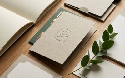
Using Images & Graphic Styling on Wine Labels
Back to the brand identity here. Wine labels in many cases use different imagery but in many cases don’t use images at all. So which will you choose? When it comes to wine label images you find a range of actual photos, realistic illustration, or clean graphic illustrations. Some of these will fill the space and others will be accentuating. Regardless of your choice these images need to truly bring out the brand and amplify the message, look & feel. But you may decide that images aren’t what’s good for the brand design and instead using only coloring, patterns or texture. These work in the same way to create an expression of the brand on the label whether you are being ultra-modern, luxe or traditional.
Choosing the Right Material for Your Wine Label
Wine brands and wineries have moved to be more innovative and differentiated in their labeling by choosing to use creative materials that amplify their brand, the message, the look and feel. Textured sheets, glossy, metallic, foil stamping, embossing, and other distinctive touches fill the wine aisles. Deciding on how your label will complement the brand and stand out is an important step to selling more wine.
Consider the following factors when selecting what material will be used for your wine labels
Paper Wine Labels
Paper labels continue to be associated with wine bottles, which customers associate with a long legacy of winemaking and are frequently the least price alternative. Papers that resemble linen or uncoated eggshell papers can provide a variety of textures to obtain the required effect.
Another advantage of paper labels is that they’re best suited for high-end embellishments:
-
- Add shine, sheen & texture with hot foil stamping
- Use embossing to create a premium & fuller look
- Highlight a focal point with spot varnishing
- Show through to the bottle using die cuts
- Protect your wine label with matte varnish
Wine Label Adhesives
There are several varieties of label adhesives, each of which performs best under various situations. You’ll need to know if your label will be adhered to glass or plastic, as well as whether you want the label to be repositionable, detachable, or permanent. When applying an adhesive, consider if it will be stored in an ice bucket, in the refrigerator, or at room temperature. It is critical to comprehend exactly what you require.
Film Wine Labels
Label material selection is about finding a structure that matches your overall brand design choices. Because film face stock labels are water resistant, they are ideal for white wine bottles that will be chilled before use (or any other bottles that will face moisture somewhere along the product life cycle).
Film has a contemporary, sleek appearance that may set your bottle out from a crowd of boring paper labels.
Durable Hybrid Wine Labels
A hybrid face stock may be your best option if you love the conventional look of paper but don’t want to sacrifice durability in cold weather and rainy situations. The combination of paper on top and film on the bottom retains the label, making it ideal for ice bucket wines.
Specialty Wine Labels
Wineries seeking for something unique may benefit from bespoke labels. These can be made of paper or film, but their look is completely unique. This might include:
-
- Brilliant white cotton labels
- Linen, felt or velvet label material
- Holographic films
- Gloss, matte, and satin varnishes or laminates
Designing and creating wine labels can be extremely difficult, but in every case it’s also just as fun and fulfilling. Even more fulfilling is when those labels stand out on the shelves, catch the attention of consumers and sell more wine!
Contact us now
For more information and if you need assistance with printing and print marketing
Phone: (413) 442-4166
Blog Form
More stories from Qualprint...
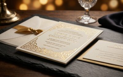
Elevating Charity Galas with Premium Event Printing Solutions
A charity gala is more than a simple gathering. It is a calculated statement of mission and a direct call to action for your most valued...
High End Sustainable Printing Services for Modern Brands
Many modern organizations are reevaluating their physical impact by choosing production methods that align with their environmental values...

Streamline Your Marketing Material Distribution with Expert Print Fulfillment Services
In the competitive landscape of modern business, effective marketing is paramount to growth. Yet, many organizations struggle with the...