Creating a Travel Brochure? 5 Design Tips To Get you Started
The travel industry is booming and it will continue to grow for some time. What does that mean for travel marketing? It’s also growing. With an actively growing industry, it’s no surprise that we are seeing an increase in print marketing for travel and tourism. Some of the more common things marketers and designers are looking for online are travel brochure design ideas and inspiration on how to create a travel brochure.
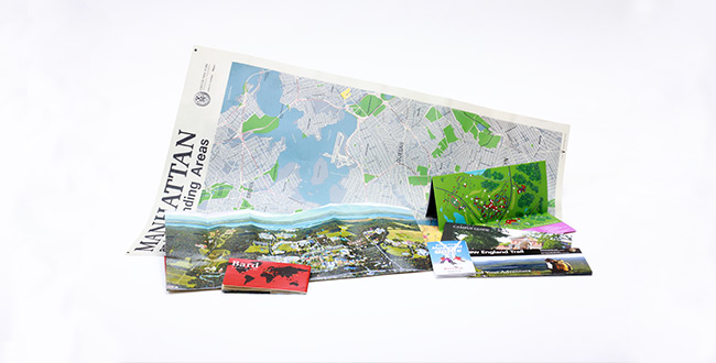
So, what exactly is a travel brochure? A travel brochure is exactly what it sounds like. A promotional brochure or small booklet that advertises an attraction, destination or activity in a place typically visited by vacationers. They can be used by travel agents to inspire their customers, shared at hotels, restaurants or visitor centers to inform visitors about what to do while visiting the destination.
One profound statistic is that over 40% of tourists are influenced by travel brochures during their stay while on vacation. That’s powerful!
As it relates to the design of a travel brochure, for them to be effective, they need to be strategically thought through. Here in this article, we’re sharing 5 design tips to get you started on designing a successful travel brochure. Those tips include:
-
- Compelling Imagery
- Color Selection
- Brochure Fold Options
- Descriptive Copy
- Contact & Geographic Information
Include Compelling Imagery
When it comes to vacationing, travel and tourism, images and visuals are critical to the success of your brochure. Someone viewing the brochure needs to be able to see what you’re trying to sell to them while also conveying an emotion of intrigue and excitement. This becomes even more important when you consider that the brochure could be sitting on a rack with 100+ other travel brochures all fighting for the attention of the same people.
Images you’ll definitely want to include are pictures of the attraction itself, product images, action shots of people participating in an activity or food or drink offerings.
The goal of visuals in a travel brochure is to sell to someone who’s never heard of your attraction and make them feel that this is a “must-see” attraction while on vacation.
Be Selective on Brochure Color Scheme
Similar to the images that you include in your brochure, the colors you choose to include are just as important. The colors used in a travel brochure serve a very intentional purpose and that is to grab attention and match the theme of the destination or attraction the brochure is selling.
Using bright colors to grab their attention and neutral colors to break up the brochure is an easy way to balance grabbing attention and keeping a clean design. But some attractions may lend the creative freedom to create “gaudy” and wild designs, which if that is the case you should do it. Examples of matching coloring to the theme to the attraction are using yellows and greens to promote a tropical destination, or muted coloring with bright bold type to showcase a museum.
Choose the Brochure Fold That Works For Your Business
When you think of designing a travel brochure, you may not think about the fold and finishing options available, but the number of folds you decide on plays a big role in the overall look and feel of your final product. In many cases your design may dictate the number of folds or panels you use in your brochure.
You can choose to use a single, bi-fold, tri-fold or quad-fold brochure depending on the amount of information you want to include in your brochure (which we discuss further in this article). This effectively creates 2 panels (front and back), 4 panels, 6 panels or 8 panels for your design to be produced on. Obviously if you have more space, you can include more information and leverage the folds to deliver information to the prospect in an engaging way. Additionally, the folds themselves can be incorporated into your brochure design!
Don’t be afraid to get creative and design something unique. The more unique the piece, the more likely the recipient will be to engage.
Brochure Copy: What To Include
Other than images, the text or copy included on your travel brochure is one of the most important elements. Once you’ve enticed someone with images and colors to pick up your brochure, they need to know exactly what you’re selling.
The copy on your brochure should be short and concise, think a couple sentences here and there or bold headlines and sub-headlines to support the imagery. You don’t want to have big paragraphs of text because it may overwhelm the prospect and deter them from reading the important message you’re trying to convey. You want the information you’re sharing to be easily consumed and absorbed.
Here are some key pieces of information you may want to include in your brochure depending on your business:
-
- It’s easy and accessible to book a trip (demonstrate value and a simple booking process)
- Fun or interesting facts about the surrounding area and local historic sites
- Things To Do (if promoting a location vs an attraction)
- Weather and Climate expectations (this may be seasonal depending on location)
- Costs or pricing (if applicable)
- Customer/tourist reviews or testimonials
When actually writing the text for your brochure, keep it informative, engaging, and descriptive. You want someone reading it to feel transported to your location or attraction.
Don’t Forget Contact & Geographic Information
This may be a no-brainer but it’s so important that we want to call attention to it here. The most important thing to have on your brochure is geographic information such as your location, a map (if applicable) and contact information (QR Code to contact form, website, phone number, email address). If you want them to book a trip, excursion, or make a reservation – you need to provide a way for them to contact you quickly.
If all of these design tips are considered, your travel brochure will sell your services for you, and is sure to get the attention and engagement you’re looking for.
Contact us now
For more information and if you need assistance with printing and print marketing
Phone: (413) 442-4166
Blog Form
+ More Articles
Educational Organizations Articles
More stories from Qualprint...
How Specialty Finishes Elevate Brand Perception
Humans engage with the world through touch long before they rely on sight. It is our primal verification system. When a consumer picks up...
How Premium Print Uncorks Wine Club Memberships
Wine is an inherently sensory experience. It demands to be swirled, smelled, and savored. Yet, many wineries rely almost exclusively on...
Psychology of Touch, Premium Print Luxury Car Marketing
The satisfying thud of a car door closing tells a potential buyer more about safety and build quality than a thousand words of copy ever...

